Rapala Packaging Design
A fishing lure is an innovation that has proved victorious against live bait. The spirit of the fishing lure ensures a much cleaner experience than its predcessors. Fishing lures “gut hook” fewer fish, they cover more distance, and they are able to target specific species efficiently. For such an advanacement in fishing technology, why can’t we have beautiful packaging to go along with it.
J Sath wanted to redirect the brand into focusing more on the beautiful lures that compliment their ingenuity—versus distracting packaging and branding.
︎ Brand Identity
︎ Logo
︎ Packaging Design
Software: Illustrator, InDesign, Photoshop,
Meshmixer, Adobe Dimensions
2018
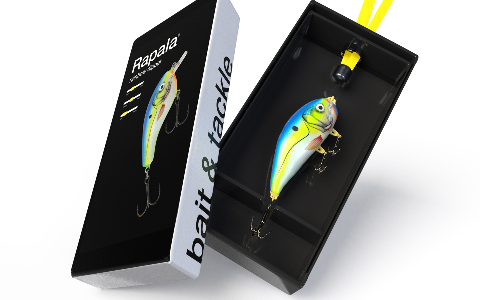
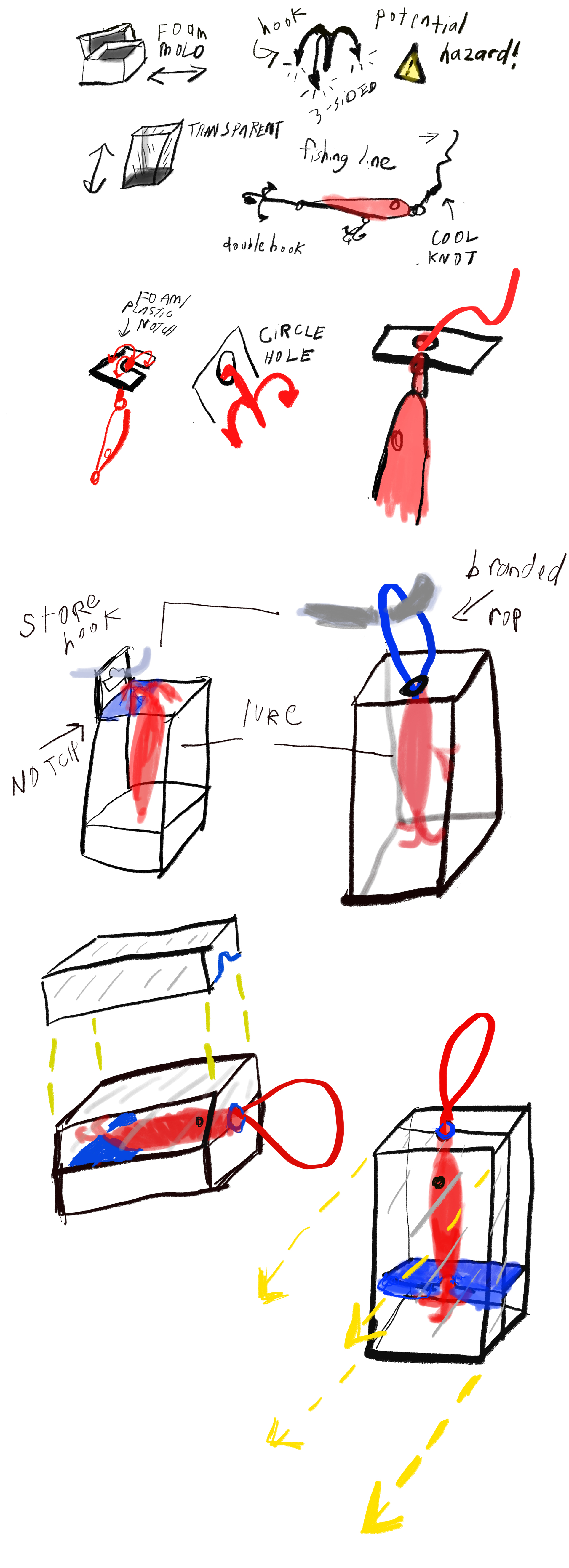
After doing research on existing lure packaging, I found that they were bulky, unattractive and seemed like they all had been carelessly thrown into an unflattering plastic box. I wanted to create something that was constructed for fishing lures with safety in mind. The obvious hazard are the hooks at the ends of the lures. Through sketching came ideation. The most viable solution was to create a notch that could safely hold the hook in place, versus dangling freely. The box itself opens upwards versus a flap at the top. This in itself provides the consumer with a true unveiling of the product. Below is my sketching using Autodesk Sketchbook.
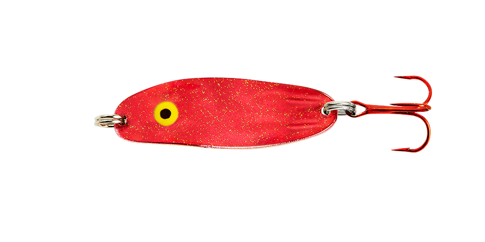
How do you catch a fish? If only it was that simple. There’s a reason it’s called fishing and not catching, right? Lures can vary with size, color, movement, amount of hooks, and much more. The overwhelming stock of fishing lures can scare new fishers away. How do you know which one to choose?
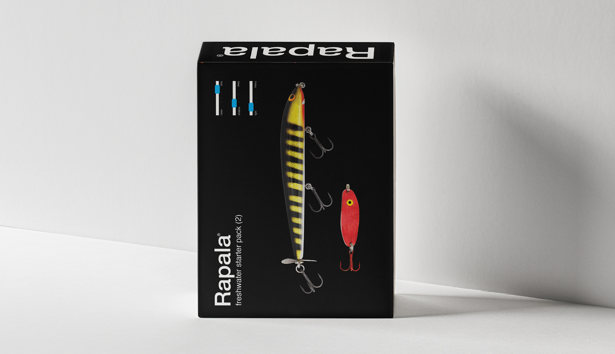
By adding simple visual-meter bars, you will be able to choose which lure is right for the type of water/fish you are in.

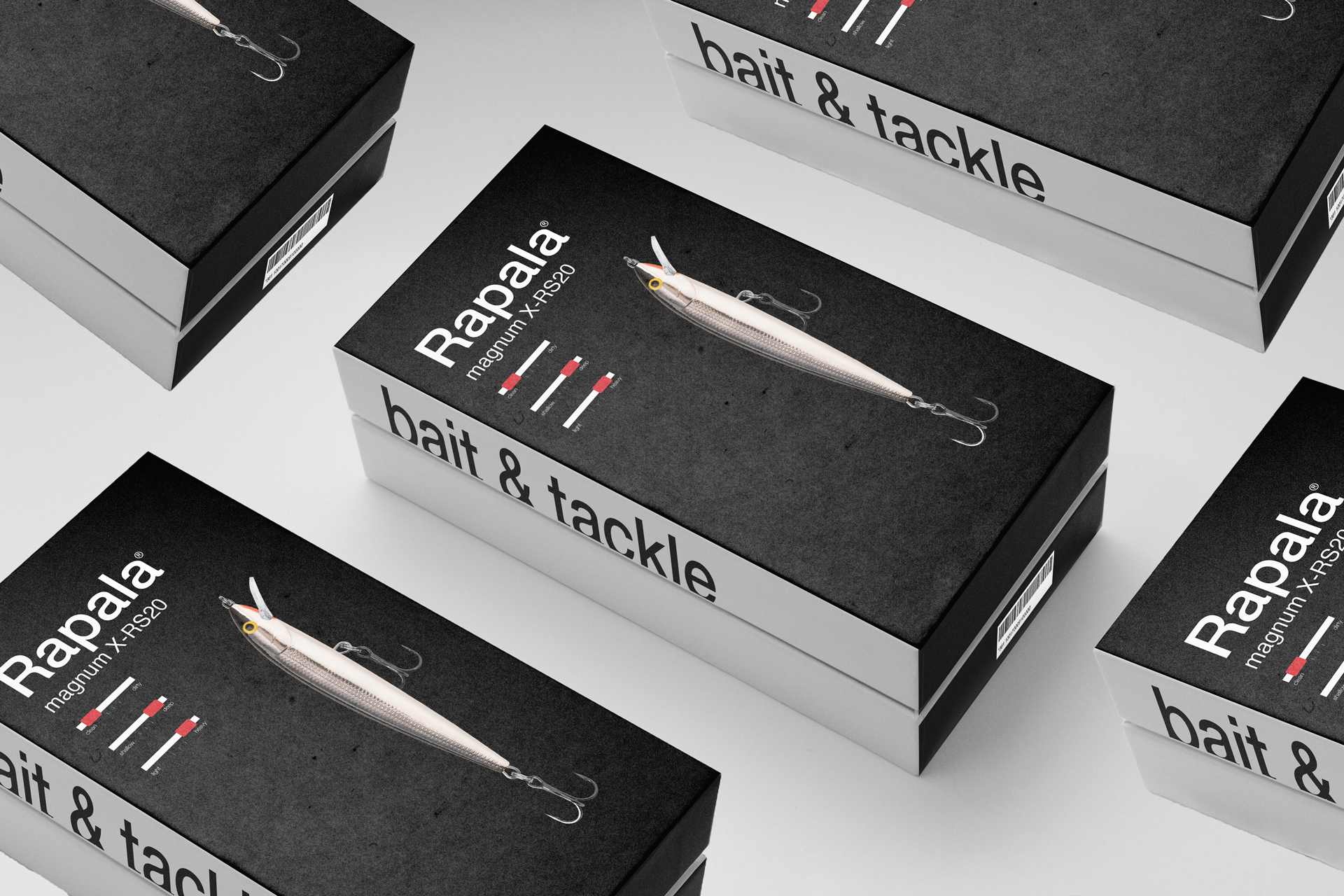
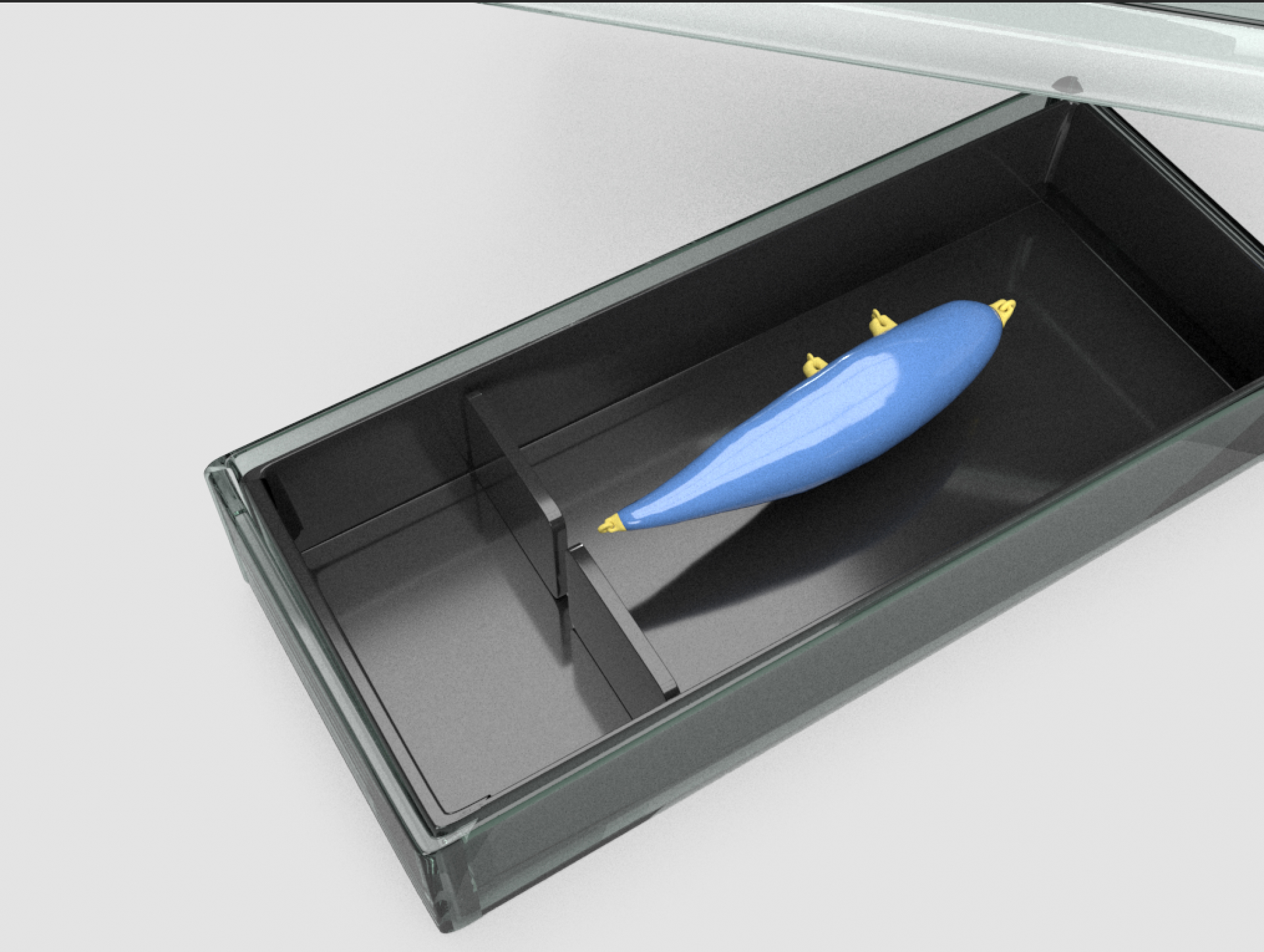
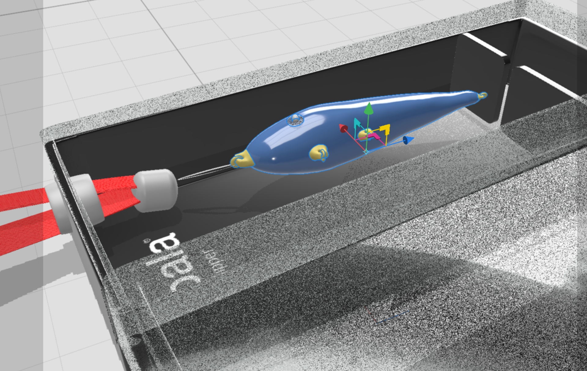
To build out a mockup of the construction of the new Rapala packaging, I created a 3D model of the lure and container in Autodesk Meshmixer and used Adobe Dimension to render a mockup.
